What are the key opportunities for improvement in the onboarding process of the Stagecoach Bus app to enhance user comprehension?
Stagecoach is a national company operating bus services in the UK. They are the sole provider of bus services in Exeter.
CASE STUDY:
SCOPE:
SKILLS:
TOOLS:
Improvements to onboarding process of the stagecoach bus app
Solo UX Writing project for my Berghs SOC UX Writing Course
User Research, Contextual Interviews, User Journey, Voice & Tone Chart, User Flows, XD Prototype, User Testing
Miro, Notion, Adobe XD, Maze
problem
solution
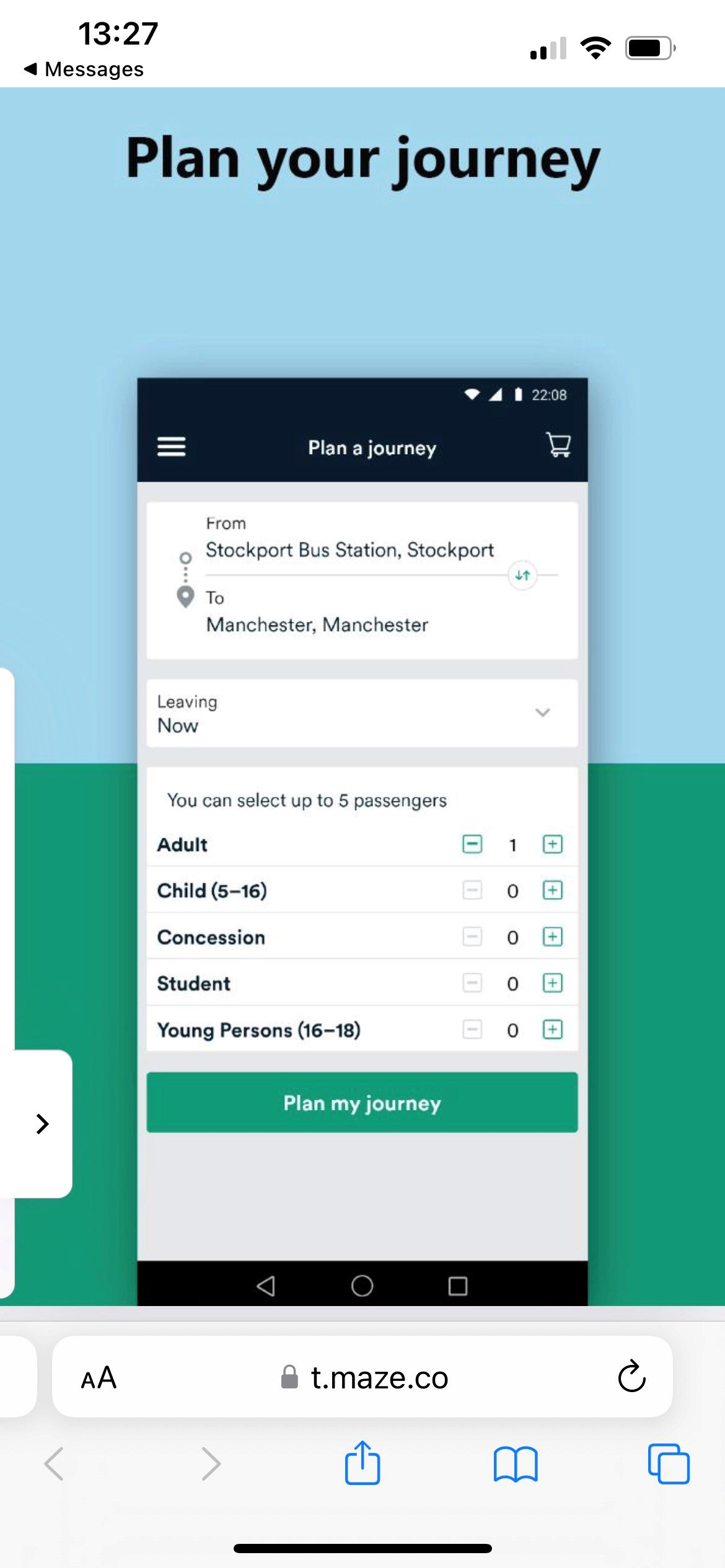
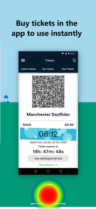
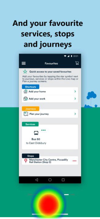
The Stagecoach Bus app offers live bus and route information, a journey planning function, the option to save favourite routes, stops, and places, and the ability to buy tickets, but the four onboarding screens do not give any detail about how to use these features leading to users not understanding the benefits
Rewriting and redesigning the onboarding process to include examples of the UI and descriptions of some of the features to aid comprehension
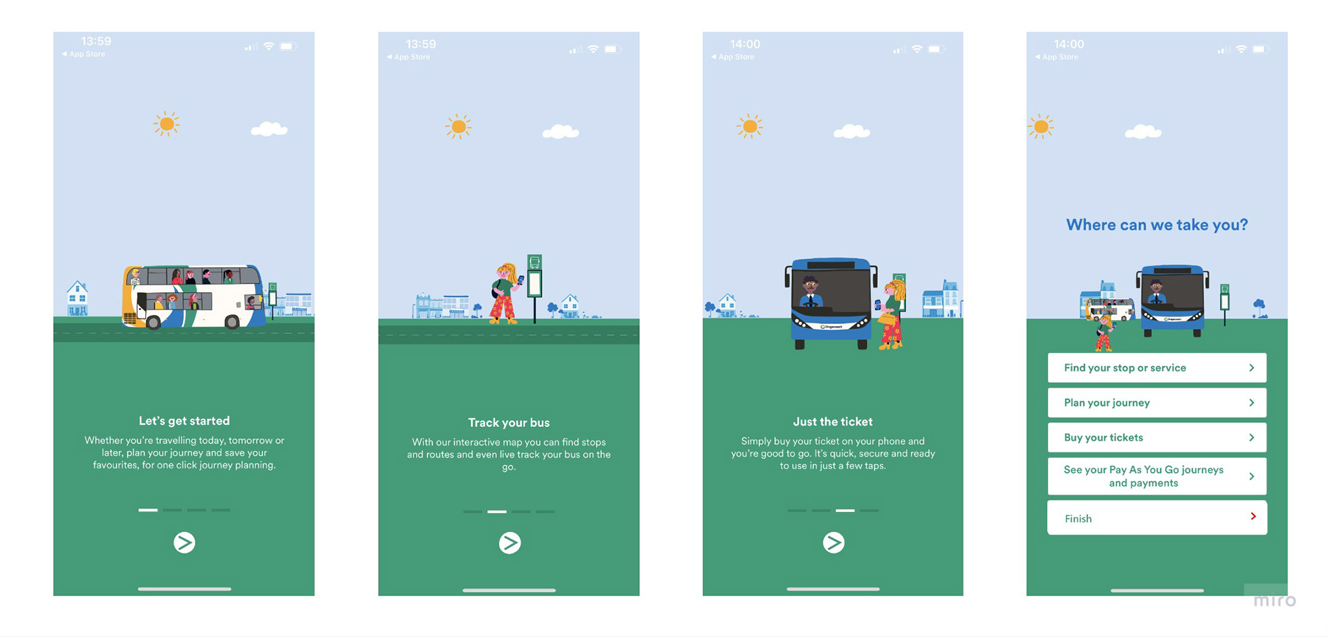
Existing Onboarding Flow
New onboarding flow 2
User Research
During the discovery phase of the project, I viewed user feedback from comments on Android and Apple app stores for the Stagecoach Bus app. The majority of comments centred on the live tracking function of the app, but as that was beyond the scope of this project I focused on comments around usability. Most comments in this area were in relation to the permissions requests each time the app was opened. I also conducted some contextual interviews with potential users who were unfamiliar with the app. The contextual interviews highlighted that there were some features that users did not understand and that the existing onboarding process did not explain.
Undertaking a heuristic evaluation, I compared the existing onboarding process against best practice principles.
user journey
Using comments from the contextual interviews I created a journey map, which alongside the existing user research and heuristic evaluation was used to inform the new UX content.
User Journey Map
Wireframes sketches and prototypes
The user research and current-state journey map revealed a failure in the onboarding process to explain the features and requirements of the app clearly. Using the Voice and Tone chart and opportunities identified in the project's discovery phase, I created some wireframe sketches that fed into creating interactive prototypes in Adobe XD.
user testing
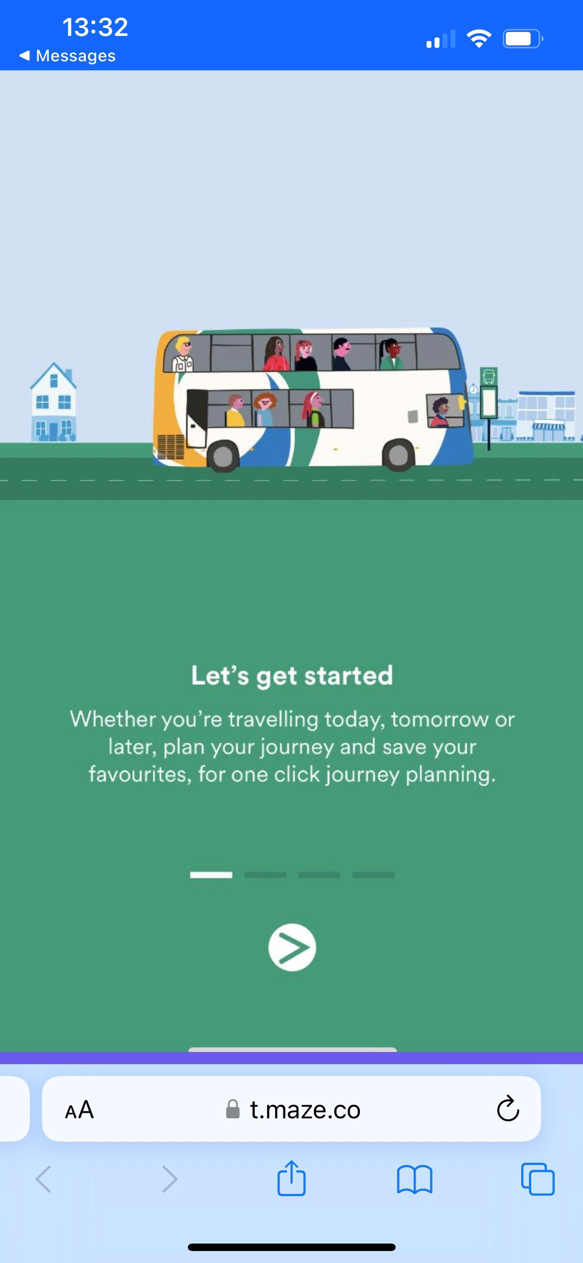
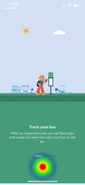
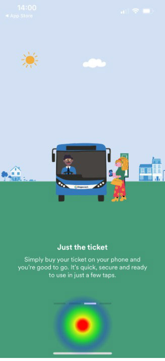
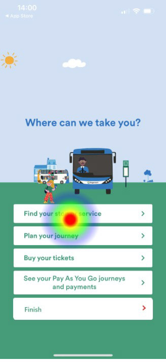
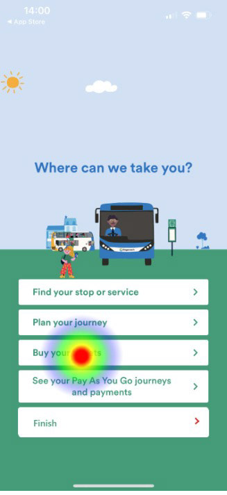
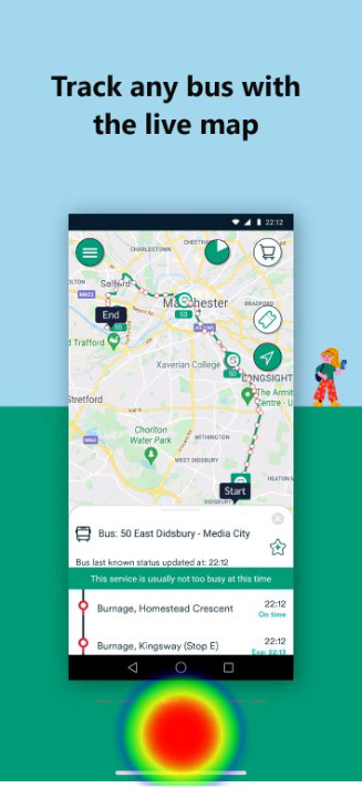
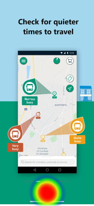
Limited by the capabilities of the free version of the user testing tool, Maze, I conducted some A/B testing of the existing onboarding process and the new ux onboarding content. Users of both tests were asked about the information shown on the onboarding screens and how helpful it was and then users were shown an image depicting the 'quieter buses' feature - where buses and routes were coloured red, amber or green to show how busy they were - green being the quietest.


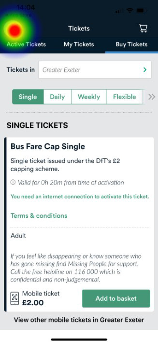
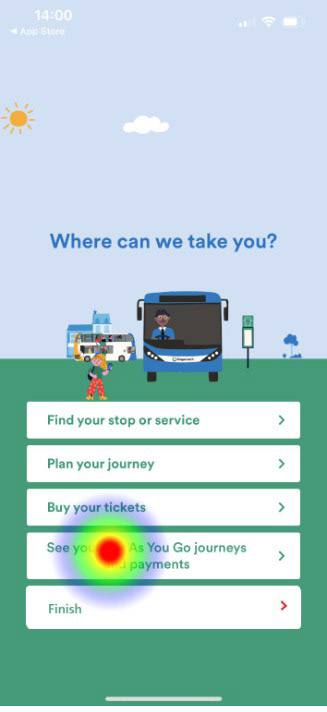
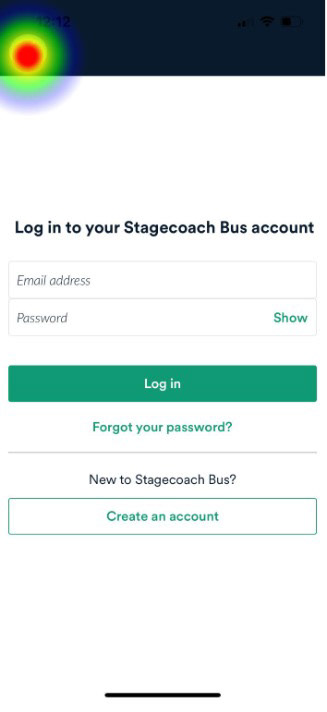

MAze a results
100% of Maze A testers did not know what the colours on the live map meant from the existing onboarding screens.
100% of Maze A testers were able to correctly identify the significance of the colours when shown the new onboarding screen which contained a description of the 'Quieter Buses' feature.

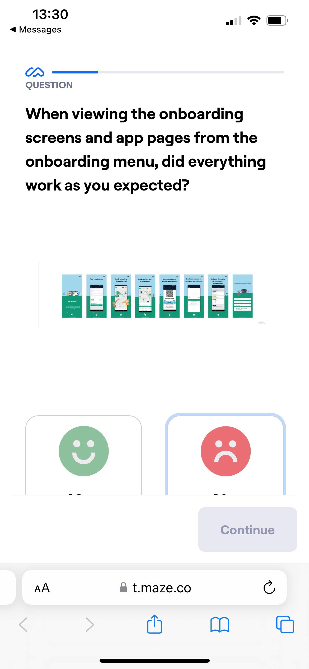
maze b results
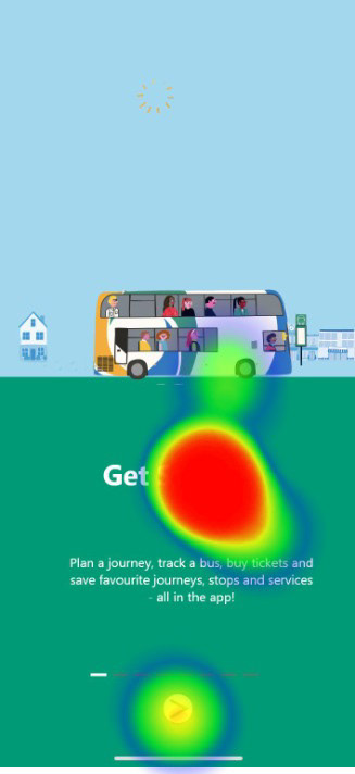
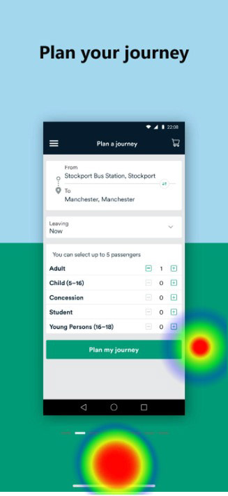
100% of user testers of Maze B stated everything worked as they expected from the information they were shown in the onboarding content.
100% of testers recorded the information in the onboarding screens as very useful or extremely useful
87% of testers were able to correctly identify the significance of the colours on the live map when shown the onboarding screen containing a description only during the onboarding process
Several users thought the 'Get Started' text was a button
next steps
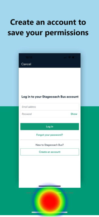
With additional time and resources, I would have liked to test all the additional features of the new UX content in the proposed onboarding screens. Due to limitations, I was only able to test the 'Quieter Bus' feature, but it would have been extremely useful to also test the impact of the 'create an account to save your permissions' information and the description of the live tracking icon.
Also, several Maze B user testers thought the 'Get Started' text was a button, further iterations on the first onboarding screen could correct this issue.

